Colour Management - How to achieve cost-effective colour reliability and consistency
Achieving good colour and spot colours reliability and consistently is easier than you may think. Dean Derhak, product manager, SAi, outlines a number of practical measures that can be taken that will directly affect the bottom line.
What constitutes good colour depends who you’re talking to; it’s rather subjective and depends on what a particular customer is willing to pay for. While that measure should not be an excuse for second-rate work, it will help print providers focus on what they are trying to accomplish. It’s as simple as that. Yet, large format printers and sign makers frequently tell me that producing consistent, predictable colour and matching spot colours is an ongoing challenge for them.
While there is no excuse for bad colour, in most jobs there are colours that are critical and others that are not.
Corporate and brand colours are very important and investing time getting them right is worthwhile. For these, PANTONE colour references are needed but for other parts of the job ‘memory colour’ will be perfectly acceptable. I mean those colours that we all identify with objects: apples are usually red; lemons are usually yellow; limes are usually green. Unless the job is focused on a particular variety of those fruits, then a fairly wide spectrum of colour variation will be acceptable.
Honing in on the important colours is a way of reducing production time and costs while still producing work that your customer will love.
It begins with the brief
Asking key questions when a job comes in is a huge help in understanding what the customer wants. Which colours are important? What is the PANTONE reference? Do you have a swatch or example of the result you are looking for? Is there a preferred substrate? With that input, printing a successful job quickly and more profitably immediately becomes easier but don’t underestimate the impact that the final substrate will have on the colour. This, too, will need to be accurately accounted for.
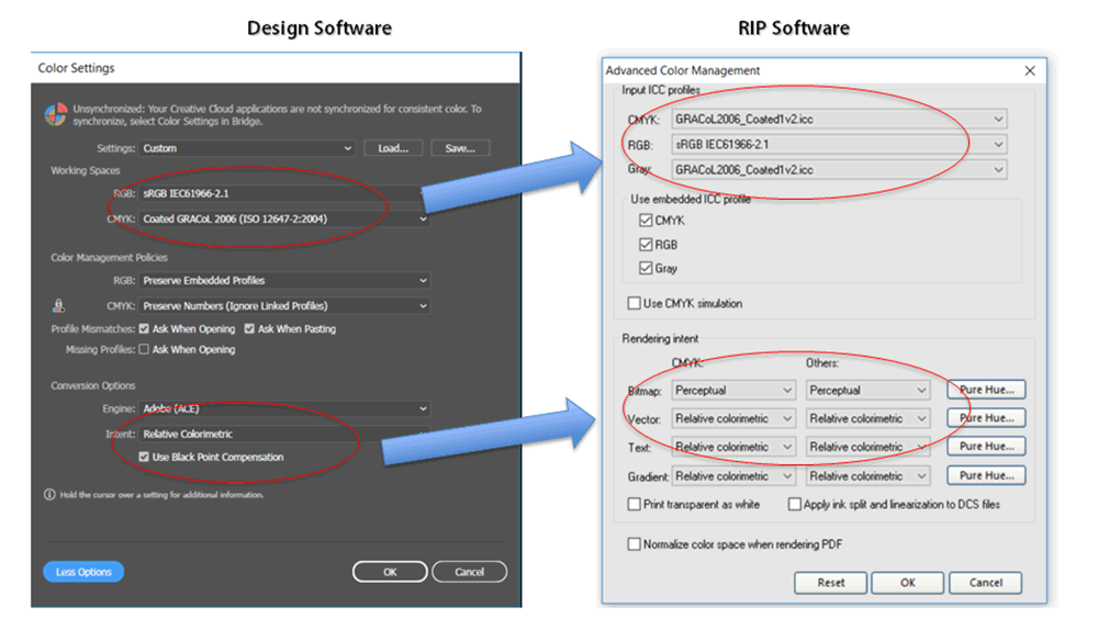
Ensuring that the colour management settings are consistent throughout your workflow is essential. The colour settings of the design file received need to match those of your own design and RIP software. Unfortunately, this cannot be done automatically and each program needs to be manually set.
The industry recommends using sRGB for RGB input/workspace profiles and GRACoL 2006 Coated for CMYK input.
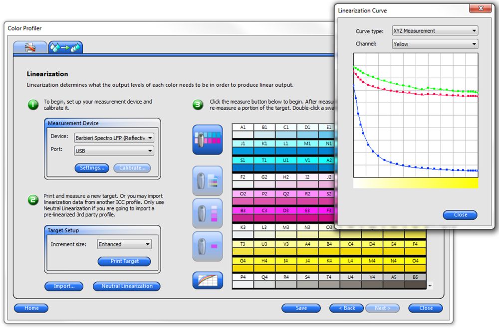
The next imperative settings are the ICC media profiles. Doing this not only ensures achieving the desired colour output but can save ink and extend the longevity of the print. It is your best guarantee of consistency and repeatability. The correct media profiles should be easy to find and taking the time to find them will pay dividends. Printer manufacturers and resellers have extensive databases of profiles as do RIP providers and media websites. Even with this information, it is still possible to produce unsaleable print if the wrong assumptions are made.
Profile settings are specifically tuned not only to the media type but to finish (matte, gloss), ink, print speed and output device. Choosing the wrong setting can result in unsaleable waste. If you can’t find your exact substrate, ensure that you choose the nearest one possible, remembering the speed and resolution criteria.
For businesses that are doing a lot of work using the same media, building your own profiles that suit your workflow and equipment is highly recommended and not as difficult as many believe.
Hitting the spot
Apart from colour settings, output consistency and reliability, reproducing accurate spot colours is a major headache for many large format printers and sign makers. The above recommendations will go a long way toward making this easier but to ensure accurate spot colours you can draw on three basic tools: visually check the colour, use spot colour matching software and use colour measurement devices. Using the correct methodology can make eyeballing a powerful tool. The first step is to check the quality of your output by printing a test sheet and looking at the colour scales. Check the greys: these should be made of equal proportions of CMY. Next, evaluate the hues; they should be consistent in their transitions both along the colour and across the different colours. Finally, look at your primary colours and ensure they are where they should be.
Next, use of PANTONE colour charts and printed samples will help you to achieve accurate spot colours. However, your chart must be printed on the same media as the final job, otherwise there will be unacceptable variations.
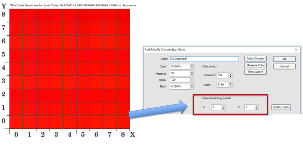
Colour matching tools such as that found in SAi Flexi software, are fast and easy to use. Given a target PANTONE colour, users can bring up the colour mapping chart and compare it to a swatch printed on your output device on the final media. The swatch is then compared to the colour map, which looks like the grid of the game ‘battleships’ and the X and Y values of the best match are entered into SAi Flexi so that the desired colour will be automatically achieved.
Inexpensive colour measurement devices are now available that can work with a mobile phone app and provide both L*a*b* and Delta-E values. For many companies, investing in higher end devices will deliver a very rapid ROI and significantly reduce ink and media waste.
Each of these procedures should become part of the routine of large format printers and sign makers and the foundation of training new operators. While seemingly basic, these can define the difference between saleable and unsaleable print and profit and loss.
Terms:
sRGB is a specific kind of RGB color space developed by the combined efforts of HP and Microsoft. sRGB is very popular but has a limited gamut; its gamut is dwarfed by Adobe RGB, another kind of RGB color space.
GRACoL® stands for the General Requirements for Applications in Commercial Offset Lithography. GRACoL is a color reproduction Specification for sheetfed offset lithography.
ICC Profiles are sets of data that characterise a colour input or output device, or a colour space, according to standards promulgated by the International Color Consortium (ICC).
L*a*b*: The CIELAB color space (also known as CIE L*a*b* or sometimes abbreviated as simply "Lab" color space) is a color space defined by the International Commission on Illumination (CIE) in 1976. It expresses color as three numerical values, L* for the lightness and a* and b* for the green–red and blue–yellow color components.
Delta-E (dE) is a single number that represents the 'distance' between two colors. Meaning that a dE between 2 colours of greater than 1 means that the difference is noticeable and less that 1 is considered not noticable, or the same colour.