More than one way to make a braille sign
Using signs incorporating braille lettering is an effective way to improve accessibility for the blind and visually impaired. Whether braille is part of your core offering, or an add-on for your customers, it doesn’t have to be overly complicated. Bear these simple specifics in mind when making braille signs to ensure that they present information as clearly as possible.
Manufacturing techniques
Historically, braille signs would be engraved. This is still commonplace, but there are a couple of other methods to consider.
Engraving
Braille can be applied to a sign using rotary engraving machines. It is important to think about the height of the dots, as well as ensuring that they have smooth, rounded surfaces, so you’ll likely need a dedicated braille cutting head.
For the most consistent results, you can use the ‘raster’ method, but you’ll need to purchase a licence as the method is proprietary. To do this, you cut a space for the dot and then insert a tiny ball (the raster) into it.
Casting
Metal, resin and plastic signs can be cast with braille dots. This is really only for high-volume sign-making, as engineering a cast can be costly for small-batch production.
Printing
You can print braille for a consistent, fast and cost-effective sign. You need an LED UV printer, which essentially builds up the dots with layer upon layer of gloss ink. These printers can typically apply dots to a broad range of different sign materials, and results are hard-wearing, perfectly spaced and sized.
Specifications
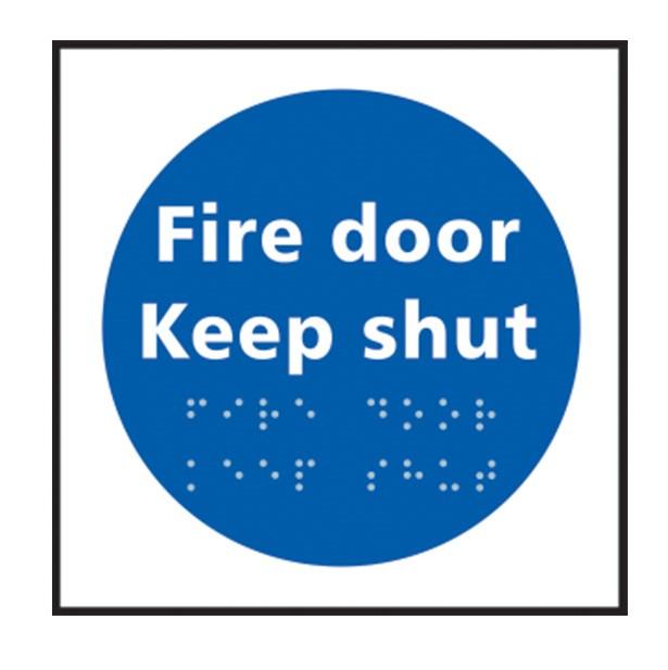
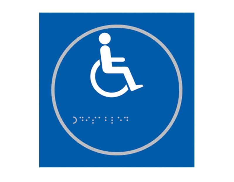
Braille signs aren’t just for the blind, they also help those with low vision. And for these people, as well as getting the dots just right, you need to pay close attention to the rest of the sign.
Contrast
Signs should contrast with the background/area they are displayed on, so they can be found easily.
Layout
Braille dots and corresponding text should be left-aligned and set horizontally. Any embossments should be set away from the braille dots so the two are not easily confused by the tactile reader. As with other signs, avoid too much information/complicated pictograms.
Dots
Dots should be domed or rounded for the reader’s comfort, and raised dots are easier to read than embedded ones. The technical specifications for dots are:
- The spherical radius should be 0.76 – 0.80 mm
- Base diameter should be 1.2 – 1.6 mm
- Height should be 0.4 – 0.9 mm
- Horizontal and vertical spacing within a cell should be 2.29 – 2.54 mm
- Dot spacing between adjacent cells should be 6.0 – 7.6 mm
Graphics
Tactile graphics are sometimes necessary. Maps, plans and directional information can be expressed much more clearly through images than text, so the standard is to use well-defined embossments. These can be achieved through the same range of processes as the braille dots.
For further information or guidance, check out the UK Association for Accessible Formats — they work to ensure consistent standards for braille.