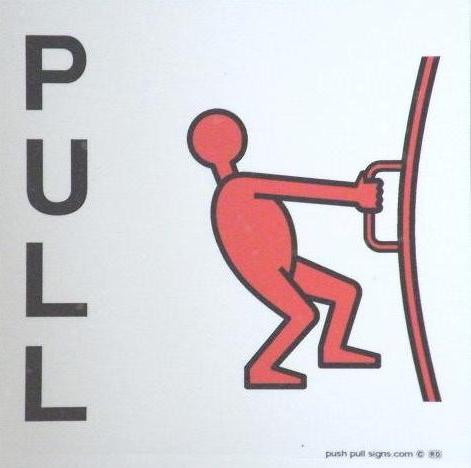
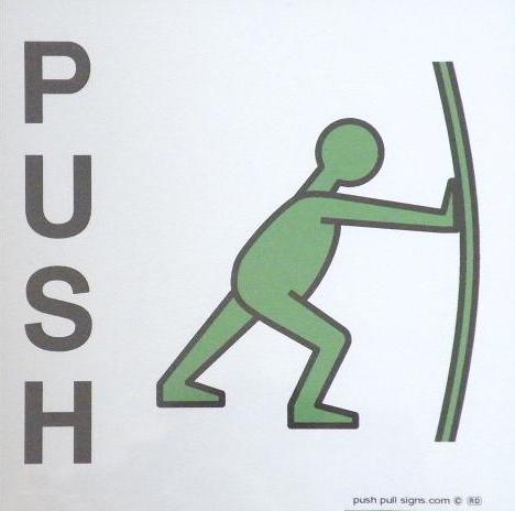
Push and pull symbols are changed to red and green
The innovative Push Pull signage system has had a makeover to make them even more effective, following a final year study at Oxford Brookes University.
Alastair Cook, who created the Push and Pull symbols, had an offer from Angus Gellatly, Professor of Experimental Psychology at Oxford Brookes University, to run an independent final year study on the signs. The project was supervised by Professor Gellatly and the test design and report was undertaken by Meera Dulabh. Retail chain Carpet Right assisted to provide a live site for sign testing.
The conclusions Alastair drew from the final report were that red and green were preferred colours and that the signs should be changed to use vertical text for the words Push and Pull.
The colour coding of the push and pull symbols adds a crucial distinction which would be particularly helpful during an emergency. He said about the colour change: "Another reason for the colour changes, is that red is associated with danger and stopping (ie pulling) and green is go, or pushing ahead."
It was concluded that vertical text made it easier to read all the letters as they come into focus at the same time when approaching from the side along a street.
The signs are protected by OHIM Registered Community Designs in Europe and Design Patents in the USA. A Trademark of “PUSH & PULL MAN” was also registered with the UK Intellectual Property office.
Alastair first had the idea to create universally recognisable symbols for push and pull in 2009. Over the years he has developed and registered a range of different push and pull symbols. The final design is available to buy as a non face adhesive sign though a distributor on Amazon.
For the full story on the development of the signs, visit www.pushandpullman.com. The website also has details of how to buy the signs.