Goodwin and Goodwin - Focus on typography


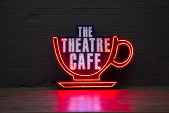
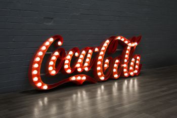
Goodwin and Goodwin have made a name for themselves with their bold, beautiful typography that has a nostalgic, retro style. When they first started making bulb letters around two years ago, they were "hugely popular" and no-one else offered them. This style is still as popular as ever and chosen by clients who want something unique. There's a good chance you've seen their work as their signs have appeared in the Strictly Come Dancing TV show, in high street shops, and on many a music stage. They make signs for well known brands such as Coca-Cola, GQ magazine, Ted Baker, MTV and Spotify and were winners of the Small Signmaker of the Year award at the BSGA British Sign Awards 2014.
They’ve been featured in many design magazines and sites, on advertising agency walls, and their art graces the interiors of the "hottest and hippest" hotels and restaurants; private clients include pop stars, celebrities and even members of the royal family!
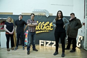
One of the directors, Viviane Goodwin, said: "For our clients our work is different to the usual corporate signage that’s on offer and they like that everything we make is hand crafted. Our slogan is ’Signs with Soul’ reflecting that everything we make is hand crafted.
"All our signs are numbered and a label is fitted with the person that made it, much like Aston Martin do with their cars. A whole record is then kept that tells the history of the sign, who made it and what parts were used. "All the letters are bent by hand in our London workshop. We have a custom built spray shop so we can apply any finish; rust and distressed are very popular finishes. We do as much in-house as possible so that we can control the quality; we work with a local neon company that comes and fits the neon glass into our channel letters. This is a respected craft and takes years of training to be any good at it."
Most of their bulbs are LEDs that they developed themselves to have the warmest colour possible and be the closest match to an incandescent bulb, which are slowly being phased out.
"Our focus has always been on good typography and design and I think its what helps set us apart," says Viviane.
"There are a lot of design conversations and visuals back and fourth that happen with a client before a sign goes into production. We spend a lot of time on Pinterest researching old signage. Sign makers in the past put much more effort in to typography back then so its really good to get inspiration from. With lighting signage a lot of inspiration for us comes from the US, particularly around New York in the 50’s/60’s. We put a lot of our own ideas in to production first as a source of inspiration on our ‘Wall of Fame’, on our website."
